Case study · original concept
Mumbai in Motion
A sneaker collection, its packaging, a three-world campaign and a launch site — one concept built from Mumbai's local trains, the CSMT terminus, vintage postcards and street lettering. This page shows how it was thought through, what was tried, and what is still a proposal.
Designed byAnuj · Concept, art direction & design
- Type
- Original concept · portfolio
- Role
- Concept, product & creative direction
- Scope
- Product · packaging · campaign · web
- Year
- 2026
Concept, not product. COMET 2.0 is a fictional label created for this case study and is not affiliated with any existing company or brand of a similar name. No pair has been manufactured, tested or sold, and no user research or usability testing was carried out.
At a glance · 30-second read
Concept · 2026The challenge
Turn a city into a sneaker without making a souvenir — then carry the same story through the box, the campaign and a site, without trapping the visitor.
Three decisions that shaped it
- One scene per panel. Each quarter is composed like a picture postcard, never a collage of landmarks, so the shoe stays wearable.
- The product never changes; the world does. Platform, street, red set — one shoe, three camera languages.
- Honest over flashy. A weak real-time 3D shoe was dropped for the approved renders, and every proposal is labelled.
What it became
- 3 editions, 1 silhouette
- Poster box, wrap and inserts
- Three-world campaign + 3 ad formats
- 20 s launch film (16:9, 9:16)
- 10-chapter launch site, live
How to read this page
- ResearchDesk research from public sources, linked.
- HypothesisAn assumption to validate, not a finding.
- ProposalA designed concept, not produced.
- BuiltExists and can be checked: the site, the assets.
01
Overview & creative brief
Mumbai is movement — a train every few minutes, footboard commuters, a snack eaten standing up. The self-set brief: design a city collection for an Indian sneaker label that turns that energy into a shoe people would actually wear, a box worth keeping, a campaign that feels observed rather than staged, and a site that tells the story as one journey from a crowded platform to the smallest stitch.
- Objective
- One concept carried consistently across product, packaging, campaign and web.
- Constraints
- A classic, wearable silhouette; two scripts at small sizes; a site that stays fast on ordinary phones.
- Success looks like
- A reviewer can explain the idea in one sentence and find it in every touchpoint.
02
Problem, opportunity & audience
The problem Research
City-themed products tend towards souvenirs: every landmark at once, flattened into a collage. They sell a place's postcard, not its life.
The opportunity Research
Homegrown sneaker brands are building on Indian culture and limited drops (see section 03). A city told in depth — everyday rituals, not just monuments — is the next step.
Intended audience Hypothesis
18–30, city-based, one pair of sneakers for everything — wearability comes first.
Buy into story, packaging and limited editions; the box and inserts are for them.
Mumbaikars abroad, for whom the references are memory rather than decoration.
03
Research, references & competition
Desk research and visual reference gathering. No interviews or surveys were run.
- 01The suburban railwayThe local train as the city's circulation: red-and-yellow rakes, footboard commuters, fast/slow indicators. India's first passenger train left Bori Bunder, where the terminus now stands, for Thane in 1853.
- 02CSMT, the terminusF. W. Stevens' terminus (completed 1888; UNESCO World Heritage Site since 2004): Victorian Gothic Revival fused with Indian craft detail — the dome, turrets and arcades.
- 03Postcards & ephemeraHand-tinted postcards, air-mail labels, cancellation marks and second-class tickets: framing, borders and limited ink sets.
- 04Street letteringEnamel station boards and hand-painted stall signs: stacked bilingual names, heavy Devanagari strokes, red on cream.
- 05Everyday cultureVada pav between trains; tennis-ball cricket on the maidans; आमची मुंबई — 'our Mumbai' in Marathi.
Competitive landscape
- Culture-led Indian labels
What they do · Homegrown brands such as Comet and Gully Labs build on nostalgia, regional scripts and motifs, sold through limited drops — the Kerala-inspired Naadu, for example, uses boat motifs and Malayalam script.
What it means for this brief · Proves the audience exists; the gap is one city told in depth and carried past the shoe.
- Global city editions
What they do · Sneakers named after cities, where the city is often a name and a colourway rather than a narrative.
What it means for this brief · Shows the format; leaves the story to the buyer.
- Souvenir merchandise
What they do · Landmark collages on tees and totes: every icon at once.
What it means for this brief · The trap to avoid — the reason for 'one scene per panel'.
Where this sits: one city, told as a complete system — shoe, box, campaign and site — through everyday rituals as much as monuments.
Sources
- Inc42 — Can Comet stir up a sneaker revolution with its storytelling playbook?
- Elevation Capital — Comet's mission to rewrite India's sneaker story
- Homegrown — The Gully Labs Naadu sneaker channels Kerala's essence
- Inc42 — How Gully Labs is luring Indian sneakerheads with desi designs
- UNESCO World Heritage List — Chhatrapati Shivaji Terminus (formerly Victoria Terminus)
04
Concept & design rationale
Mumbai in Motion: the city as it moves, worn on the feet that move through it.
The railway is the spine — the commute is what every Mumbaikar shares. The terminus gives the architecture, postcards give the framing, street lettering gives the voice and vada pav gives the warmth a souvenir would leave out.
- P1Wearable firstThe silhouette stays a classic low-top court shoe. Without the graphics, it should still be a shoe someone wants.
- P2One scene per panelEach quarter carries one composed view with one horizon line, like a picture postcard — never a collage of icons.
- P3Two scripts, one hierarchyDevanagari is the voice (red, hand-painted); Latin capitals are the label (navy, enamel-board). Every Hindi word is proofread.
- P4Discover, don't announceThe loudest references sit where the eye lands first; the small ones (vada pav, the postmark) reward a second look.
- P5Honest presentationRenders are labelled as renders, proposals as proposals. Nothing claims to be manufactured, tested or for sale.
05
Footwear exploration & final details
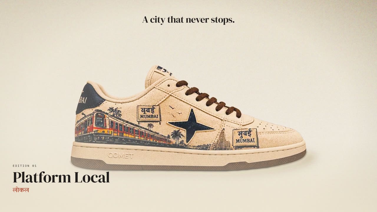
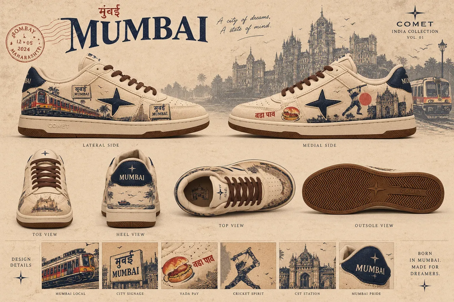
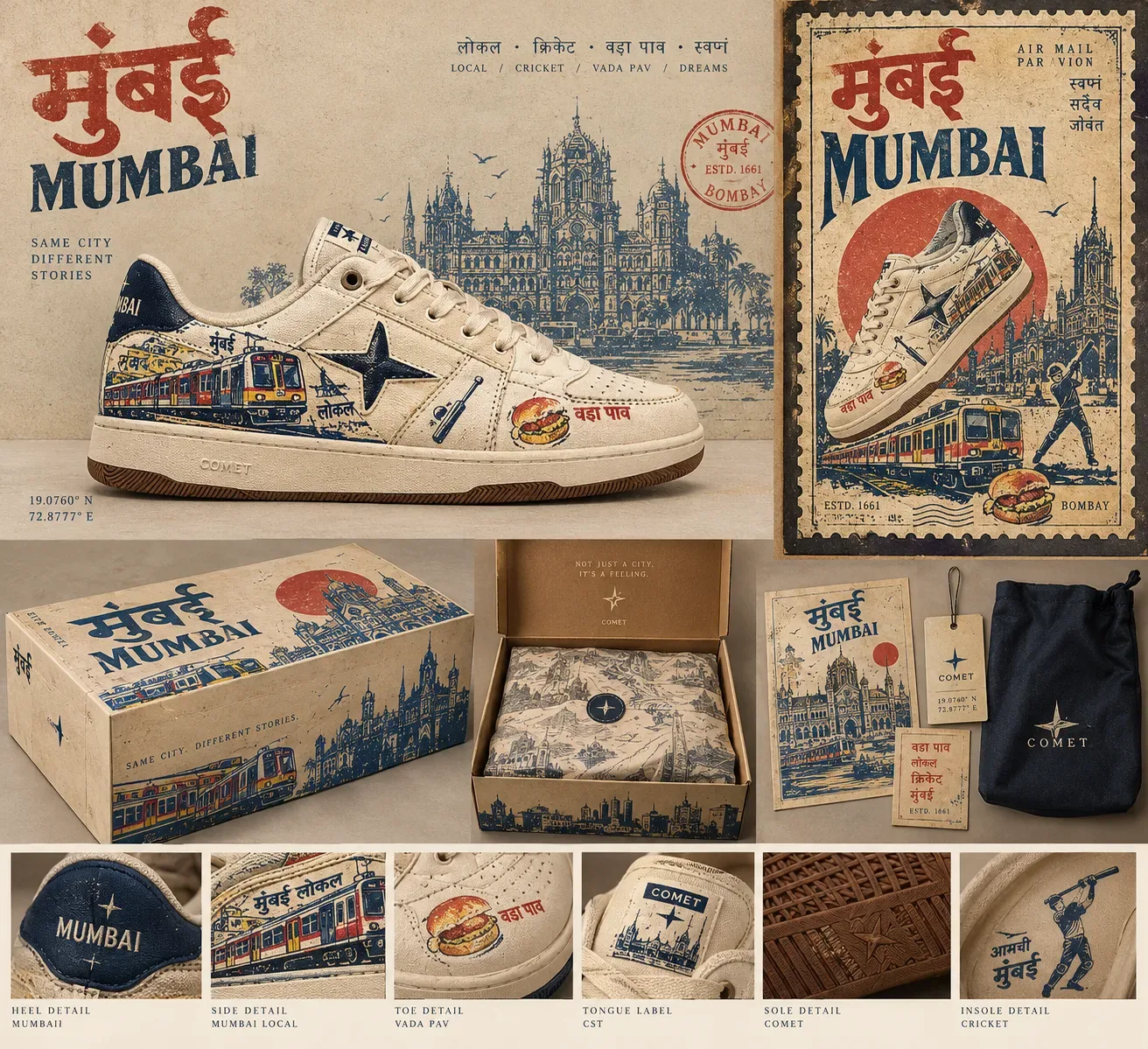
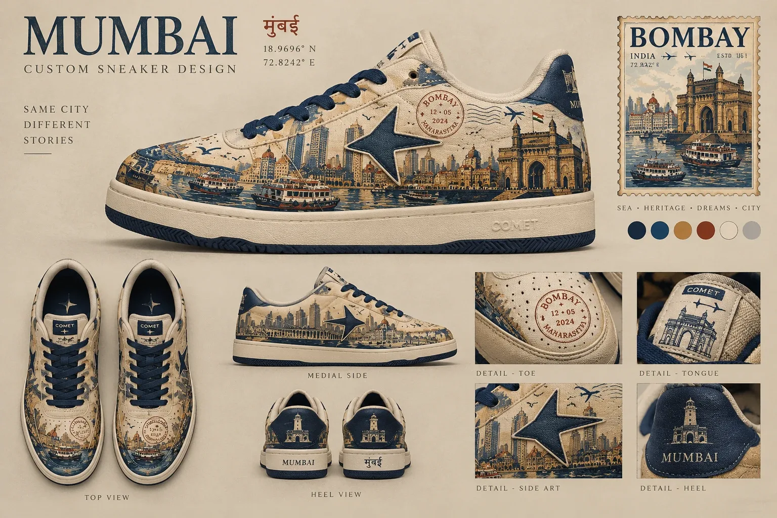
Three directions on one silhouette, each a full board. Platform Local became the hero because it is the most wearable and carries the commute; Postcard became the collector's edition and the box system; Harbour, the only all-over print, became the statement edition.
Graphic placement
- Quarters carry the scenes; the train runs heel to toe so it reads as motion.
- The star overlays the art — the constant across editions.
- The vamp and eyestay stay clean: perforations and stitching only.
- Heel and tongue carry the names: MUMBAI embroidered, COMET woven.
- Small references (vada pav, postmark) sit low, near the toe, to be discovered.
Proposed materials Proposal
- Upper
- Cream cotton canvas, printed artwork (print method to be proven in strike-offs)
- Star & heel counter
- Navy suede overlays; the star sits over the artwork on both quarters
- Lettering
- COMET woven tongue label; MUMBAI embroidered at the heel
- Laces & lining
- Chai-brown cotton laces; navy lining
- Outsole
- Gum rubber cupsole, herringbone tread, star medallion at the pivot point
What the boards got wrong. Concept renders are not production artwork. The Platform Local sign tile reads मुबई — the anusvara is missing; it must be मुंबई. The Harbour board draws the star at two different sizes in two views. Both are logged for the production artwork rather than hidden.
06
Branding, packaging & materials
Collection lockup
MUMBAI IN MOTION
The roundel mark — the shoe's four-point star knocked out of a disc, the same seal that closes the box — with the “2.0” and a wide-tracked collection line.
Palette
- Platform cream#ece2cf
- Signal navy#1d2a4c
- Charcoal#1f1d1b
- Terracotta#b3533a
- Gum#7a4a29
- Set vermilion#9e2521
Type
Mumbai
DM Serif Display — editorial display
मुंबई लोकल
Yatra One — hand-painted Devanagari voice
आमची मुंबई
Tiro Devanagari Hindi — readable Devanagari text
Archivo — interface and body
IBM Plex Mono — tickets, data, 19.0760° N
Packaging system
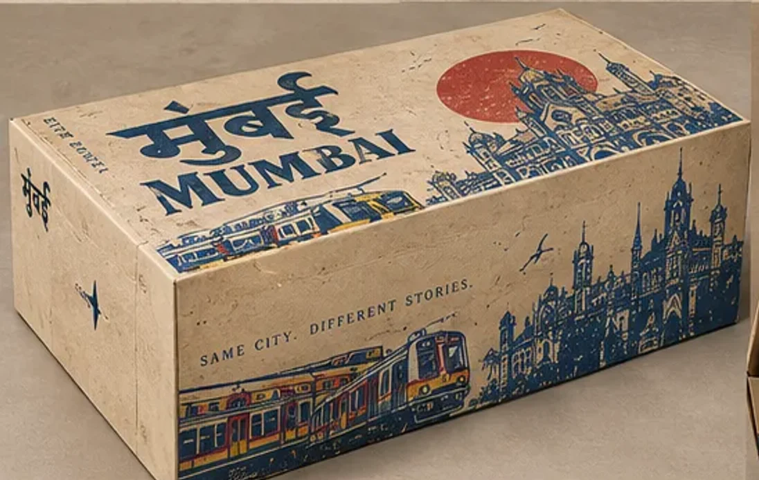
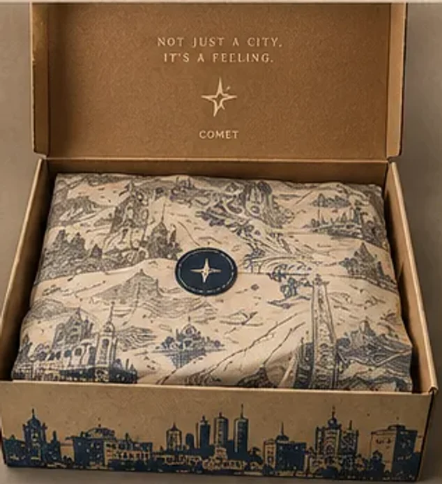
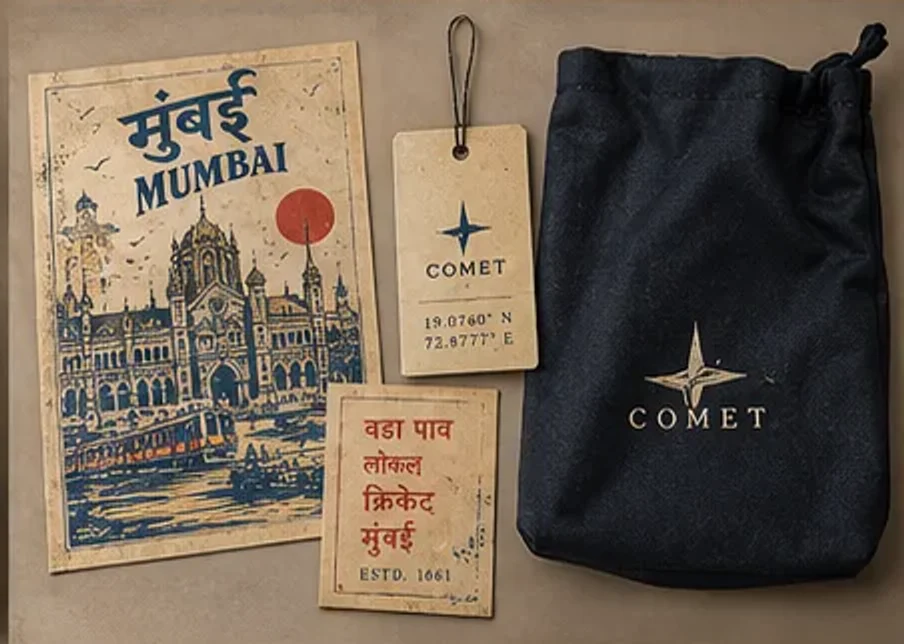
Structure: a two-piece box — lid 340 × 220 × 40 mm carrying the poster artwork, base 334 × 214 × 120 mm in kraft with a navy interior. The dieline is shown in the Studio chapter. Material choices: canvas because it takes print like poster paper, suede for depth in the navy, gum for warmth underfoot; kraft for the base so the lid does the talking.
07
Website & digital experience
A launch site that doubles as the case study's centrepiece: it opens on the platform, pushes in to the shoe, then moves through the product, the box, the campaign and the studio. Information architecture:
- 01 The city
- 02 The reveal
- 03 Silhouette
- 04 Postcard
- 05 Details
- 06 Packaging
- 07 Collection
- 08 Campaign
- 09 Studio
- 10 Specifications
| Token | Timing | Easing | Used for |
|---|---|---|---|
| Reveal | 900 ms | cubic-bezier(.22, 1, .36, 1) | Editorial text and frames entering the viewport |
| Sequence step | 700 ms | cubic-bezier(.22, 1, .36, 1) | Product views, details and box stages advancing with scroll |
| Camera push | 1.6 screens of scroll | quadratic ease-in | Opening: platform → shoe, transform-only |
| Section jump | 1.2 s | smooth scroll, header-aware | Header, menu and chapter links; URL hash updated |
| Frame viewer | 280 ms | cubic-bezier(.22, 1, .36, 1) | Full-screen campaign frames, arrow keys and Esc |
- Navigation that behavesHeader, menu, chapter rail and footer links scroll smoothly, clear the sticky header, update the URL hash and work with Back; a direct link to /#studio lands on the heading.
- Exploration, not decorationA six-angle product viewer, hotspots on the shoe and box, an edition switcher and a full-screen frame viewer with keyboard support.
- Accessible by defaultSkip-intro control, labelled controls, focus returned after the viewer closes, Esc to close, and a static opening when reduced motion is requested.
- Light where it countsStatically rendered pages, no WebGL, only transform and opacity animated, responsive images and lazy loading below the fold.
08
Campaign strategy & advertising assets
- Insight
- Everyone in Mumbai shares the commute; no one buys a shoe to remember a monument.
- Idea
- From the platform to the street. From CSMT to the Gateway. From the city to the spotlight.
- Approach
- The product never changes between scenes; the world around it does. Observed on the platform, controlled on the red set.
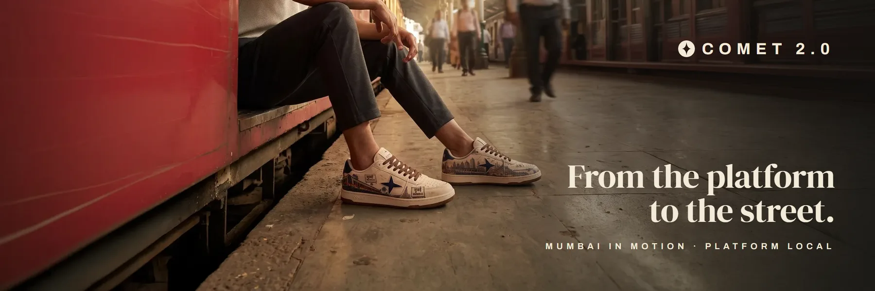
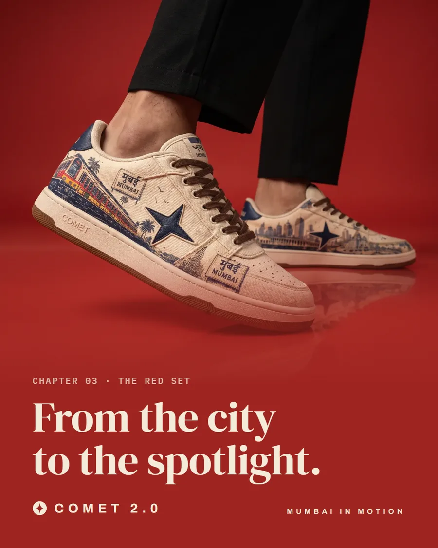
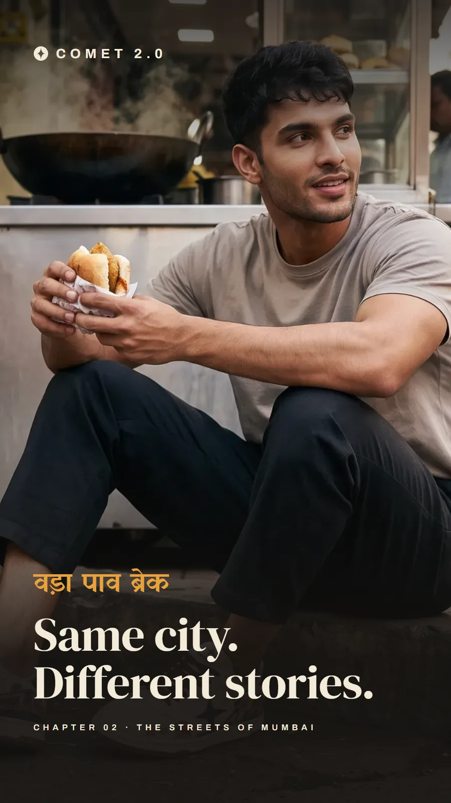
Station hoarding (3:1), feed post (4:5) and story (9:16), set in the collection's type and lockup. Layouts are built; placements are proposed.
Proposed rollout Proposal
- 01Tease
Station hoardings and the launch film — the platform, no product name.
- 02Reveal
Feed posts and red-set frames: the shoe as the hero object.
- 03Drop
Stories from the street, the poster box, and the site as the destination.
09
Iterations, challenges & trade-offs
- 01Real-time 3D → renders
Version 1 built the shoe as a parametric mesh in code and projected the board art onto it. It read as a blocky toe, a slab sole and smeared artwork.
Decision · Dropped 3D until a properly modelled shoe exists; the approved renders lead, labelled as renders.
- 02Storyboard → campaign frame
The illustrated platform proved the camera push into the shoe, but read as a drawing rather than a launch.
Decision · Opened on the platform frame instead, extended to landscape for wide screens; the storyboard is kept in the Studio chapter as process.
- 03बंदर → हार्बर
The Harbour edition's first Hindi name, बंदर, is most often read as 'monkey'.
Decision · Renamed हार्बर — the word Mumbaikars use for the Harbour line — across the site and the launch film.
- 04मुबई, left visible
The Platform Local board's sign tile drops the anusvara; it must read मुंबई.
Decision · Logged for production artwork and shown in the Studio chapter instead of hidden.
- 05Consistency over quantity
Some campaign frames drew the shoe's artwork differently from the approved design.
Decision · Removed the frame whose artwork drifted furthest; consistency of the product beats one more image.
- 06Depth vs. length
A ten-chapter story risks losing visitors before the end.
Decision · Every chapter is reachable from the header, the menu and, on wide screens, the chapter rail; the campaign and studio are linked directly.
10
Deliverables, potential value & next steps
Delivered Built
- Three sneaker editions on one silhouette, with placement rationale
- Collection lockup, palette and bilingual type system
- Poster box, wrap, inserts and a proposed dieline
- Three-world campaign, brand frame and three ad formats
- 20-second launch film in 16:9 and 9:16
- 10-chapter launch site and this case study
Potential value Hypothesis
- Fits a limited-drop model: three editions, three drops.
- A poster box people keep could raise perceived value and unboxing posts.
- The system extends to a city series — the Delhi Metro, Kolkata's trams — without a new visual language.
- One set of frames feeds every channel, from hoardings to stories.
Unvalidated. To test: waitlist sign-ups per edition, sell-through per drop, and unboxing posts per order.
Next, if this went further
- • Correct the board lettering and redraw the art as vector separations
- • Material sampling and print strike-offs on canvas
- • A properly modelled 3D shoe before bringing back real-time 3D
- • Produce the campaign's motion pieces for the video slots
- • Usability-test the scroll story, especially on low-end phones
- • Test the box structure with a physical mock-up
+
What this project shows
The strongest evidence is in art direction, brand and the digital experience. Each line below says what the work shows and where it stops.
- Product / UX designer
Evidence · Information architecture of a ten-chapter story; navigation that scrolls, updates the URL and respects the sticky header; interactive product viewer and frame viewer; accessibility defaults.
Limit · No usability testing has been run yet.
- UI designer
Evidence · Responsive editorial layouts from phone to desktop, a type system spanning Latin and Devanagari, design tokens shared by site and assets.
- Visual / brand designer
Evidence · Collection lockup, palette, bilingual type system, poster box, inserts and the graphic placement system on the shoe.
- Art director
Evidence · Three campaign worlds, frame selection and sequencing, crop and grade decisions, the red-set brand frame.
Limit · Frames are concept imagery, not a photo shoot.
- Marketing designer / strategist
Evidence · Competitive positioning, audience hypotheses, a tease–reveal–drop rollout and channel-specific assets.
Limit · No campaign has run; nothing is measured.
- Creative technologist
Evidence · Specified and directed a coded scroll experience, the motion system and the asset pipelines (frames, film, ads).
Limit · Built with an AI coding assistant to my direction.
| Role | Evidence in this project | Limit |
|---|---|---|
| Product / UX designer | Information architecture of a ten-chapter story; navigation that scrolls, updates the URL and respects the sticky header; interactive product viewer and frame viewer; accessibility defaults. | No usability testing has been run yet. |
| UI designer | Responsive editorial layouts from phone to desktop, a type system spanning Latin and Devanagari, design tokens shared by site and assets. | — |
| Visual / brand designer | Collection lockup, palette, bilingual type system, poster box, inserts and the graphic placement system on the shoe. | — |
| Art director | Three campaign worlds, frame selection and sequencing, crop and grade decisions, the red-set brand frame. | Frames are concept imagery, not a photo shoot. |
| Marketing designer / strategist | Competitive positioning, audience hypotheses, a tease–reveal–drop rollout and channel-specific assets. | No campaign has run; nothing is measured. |
| Creative technologist | Specified and directed a coded scroll experience, the motion system and the asset pipelines (frames, film, ads). | Built with an AI coding assistant to my direction. |
+
My role & method
Mine
- The concept, the brief and the cultural direction.
- The sneaker ideas, the three editions and where every graphic sits.
- The packaging concept and the unboxing sequence.
- Art direction: the three campaign worlds, and selecting, correcting and sequencing every frame.
- The site's structure, content and motion direction.
Tools in the workflow
- Concept boards and campaign frames were generated with image-generation tools from my written briefs, then curated and corrected.
- Studio frames were composited and graded in Adobe Photoshop and Lightroom; the product pixels are never redrawn.
- The site was built with an AI coding assistant working to my structure and direction.