02 · The reveal
A city that never stops.
MUMBAI IN MOTION
“A city that never stops. A story that moves with every step.”
Somewhere in the crowd
One detail moves differently.
Built to be worn.
A low-top court shape with a cupsole and a padded collar — deliberately familiar. The proportions stay classic so the city can be the expressive part.
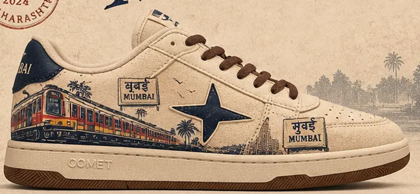
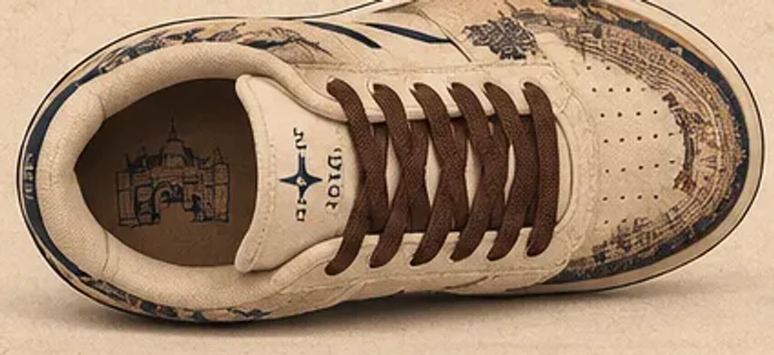
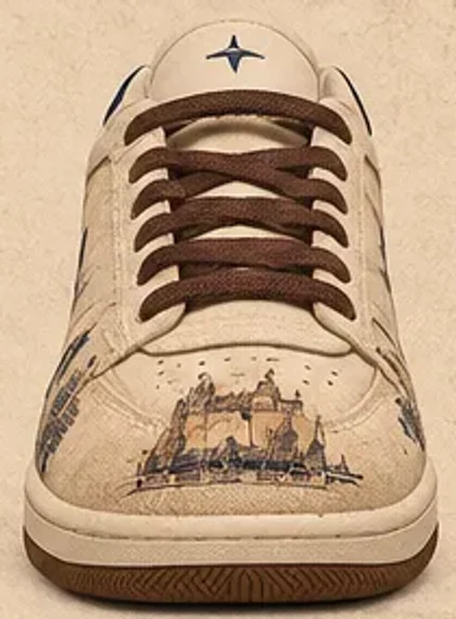
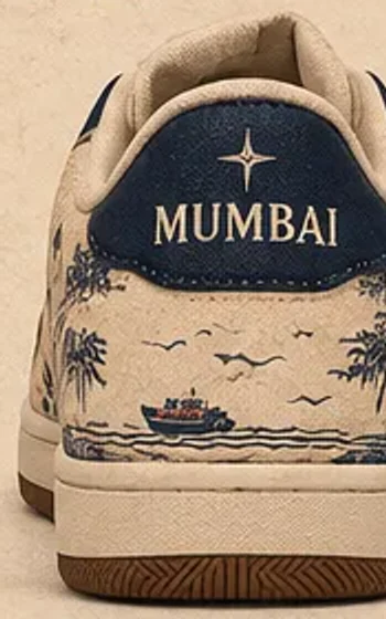
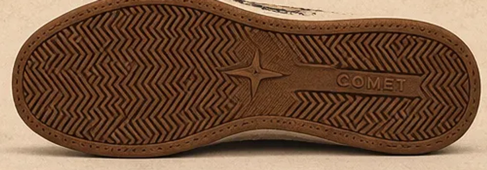
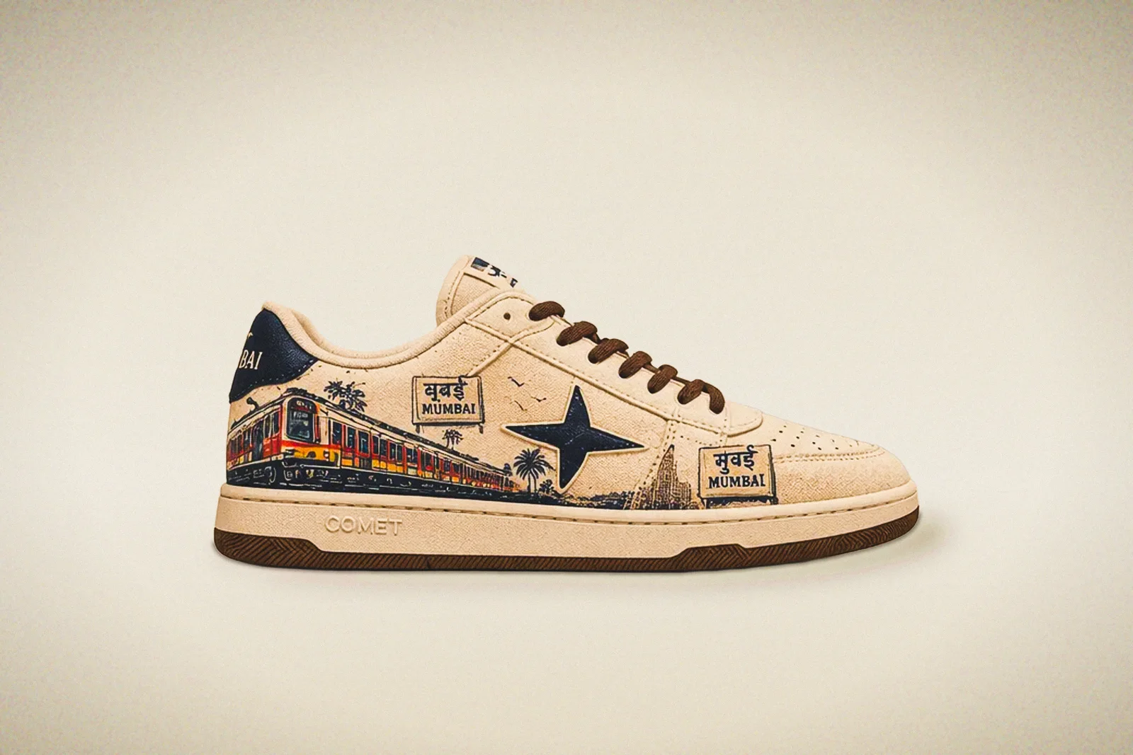
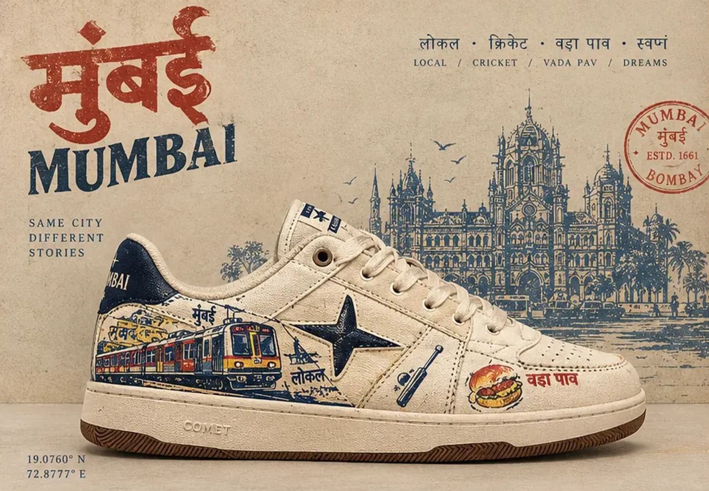
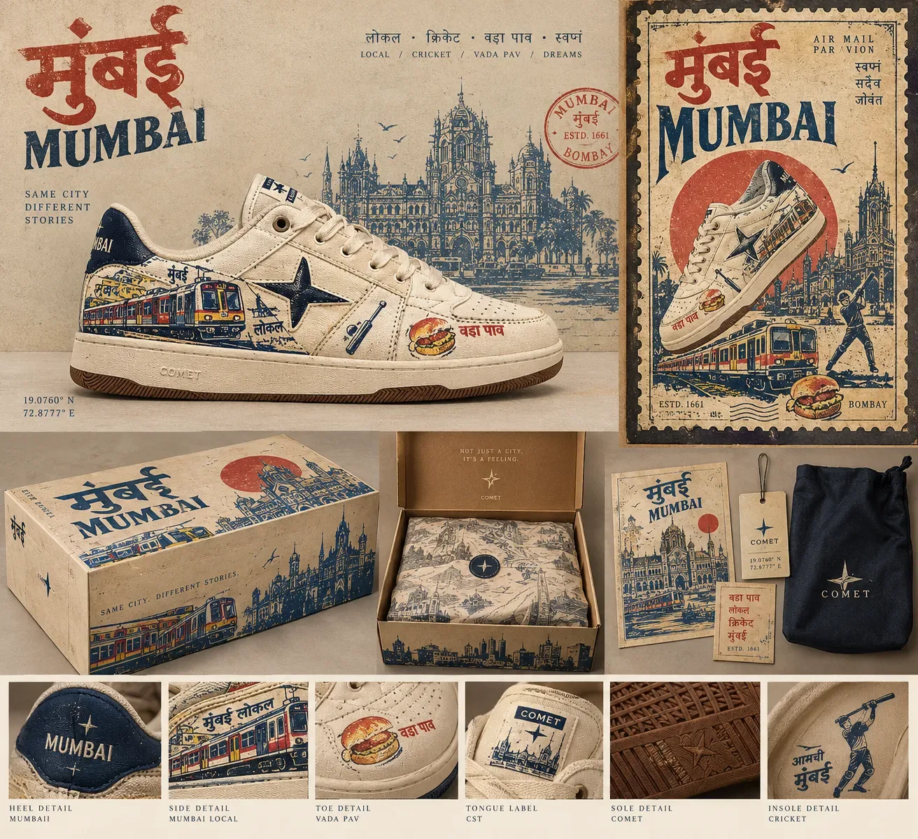
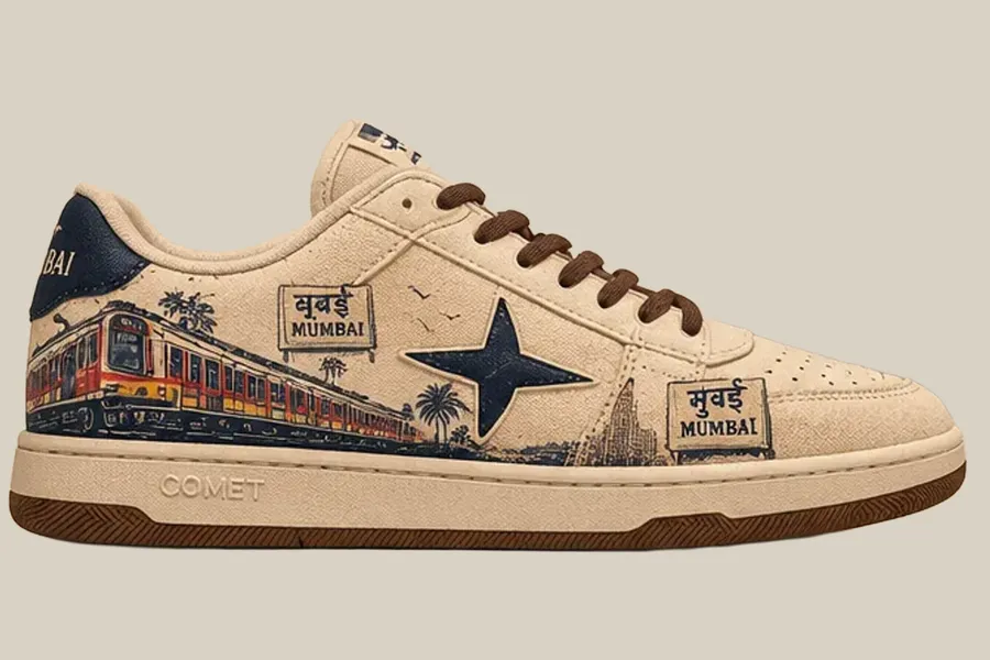
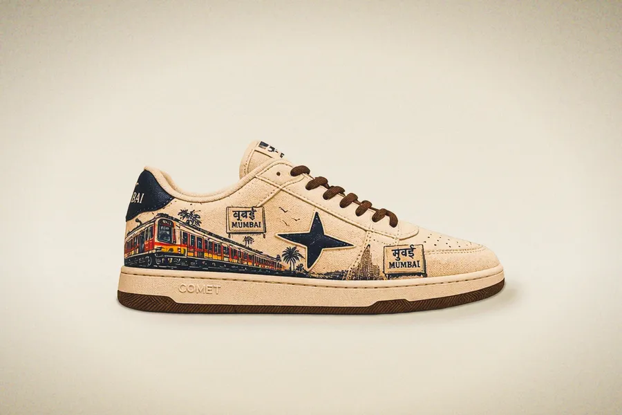
Lateral. The train, the station sign and the star — the side the city sees.
Sent home from Bombay.
- 01One view per panelEach quarter is composed like a single postcard: one scene, never a collage of icons.
- 02One horizon lineTrain tracks, harbour and street sit on a shared line, so the scene reads continuously as the shoe turns.
- 03A limited ink setNavy linework, cream ground, a single warm accent — the economy of old two-colour printing.
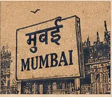
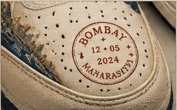
Read it closely.
The Mumbai Local
मुंबई लोकल
- Inspiration
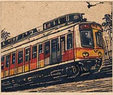
- The suburban EMU rake — red and yellow livery, open doors, commuters riding the footboard. India's first passenger train left Bori Bunder, where the terminus now stands, for Thane in April 1853.
- Design decision
- The train runs heel-to-toe along the quarter so it reads as motion when the wearer walks. It stops short of the star and keeps below the eyestay, leaving the lacing zone clean.
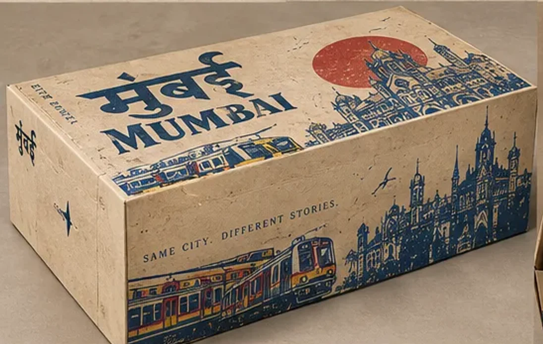
A poster you can open.
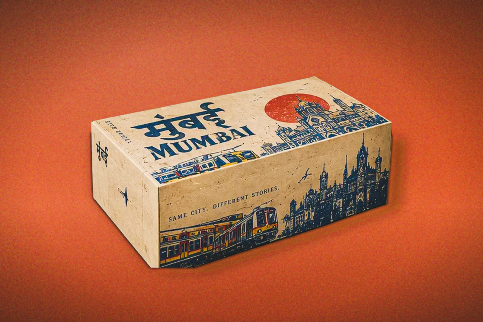
The box extends the shoe's design system: travel-poster composition, railway ephemera, the same navy, cream and terracotta.
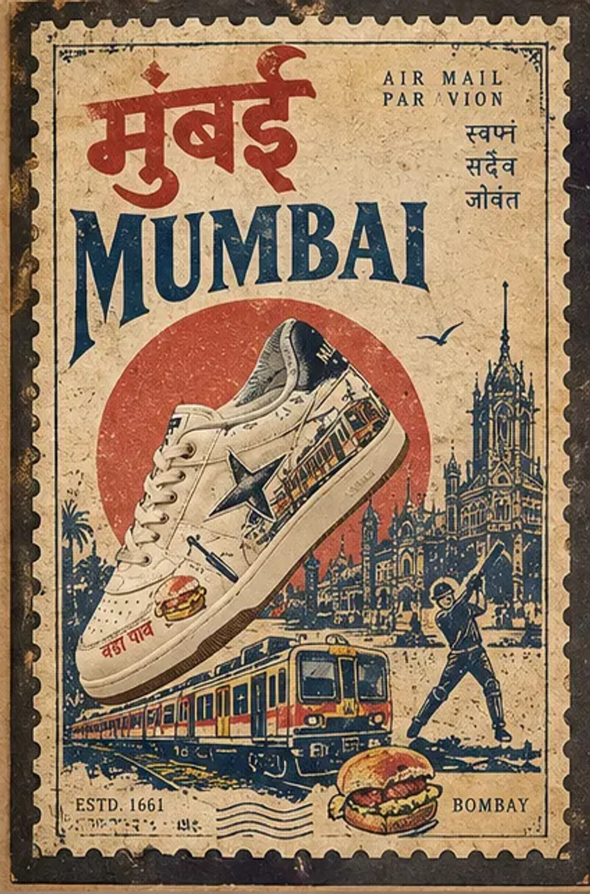
The lid is a poster: the shoe breaks the frame, CST etched behind it, a red sun.
The Cover Poster
The sneaker is the subject, cropped large and breaking the frame, with the terminus etched behind it and a red sun as the only flat shape. Devanagari sits above the Latin wordmark so the Hindi name leads.
07 · The collection
MUMBAI IN MOTION
A city that never stops.
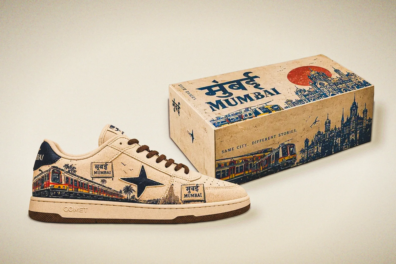
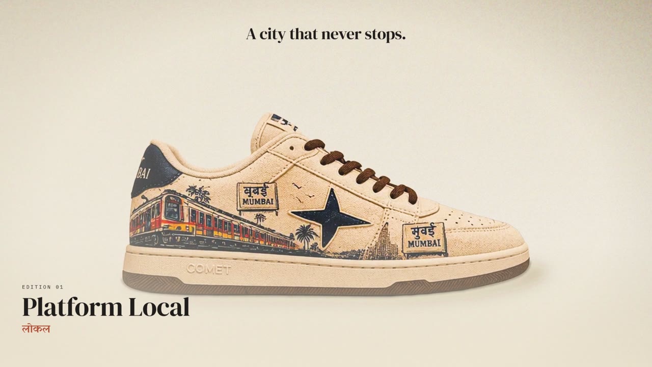
Three editions on one silhouette, each in its poster box. Shown here: Platform Local, the everyday edition.
The launch film · 20 s
The collection, in motion.
Built from the studio frames. Silent, and it pauses when you scroll away.
Three editions. One silhouette.
Product details08 · The campaign
From the platform to the street.
From CSMT to the Gateway.
From the city to the spotlight.
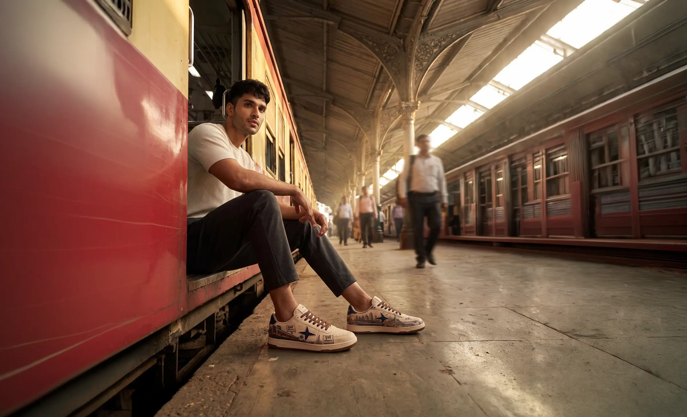
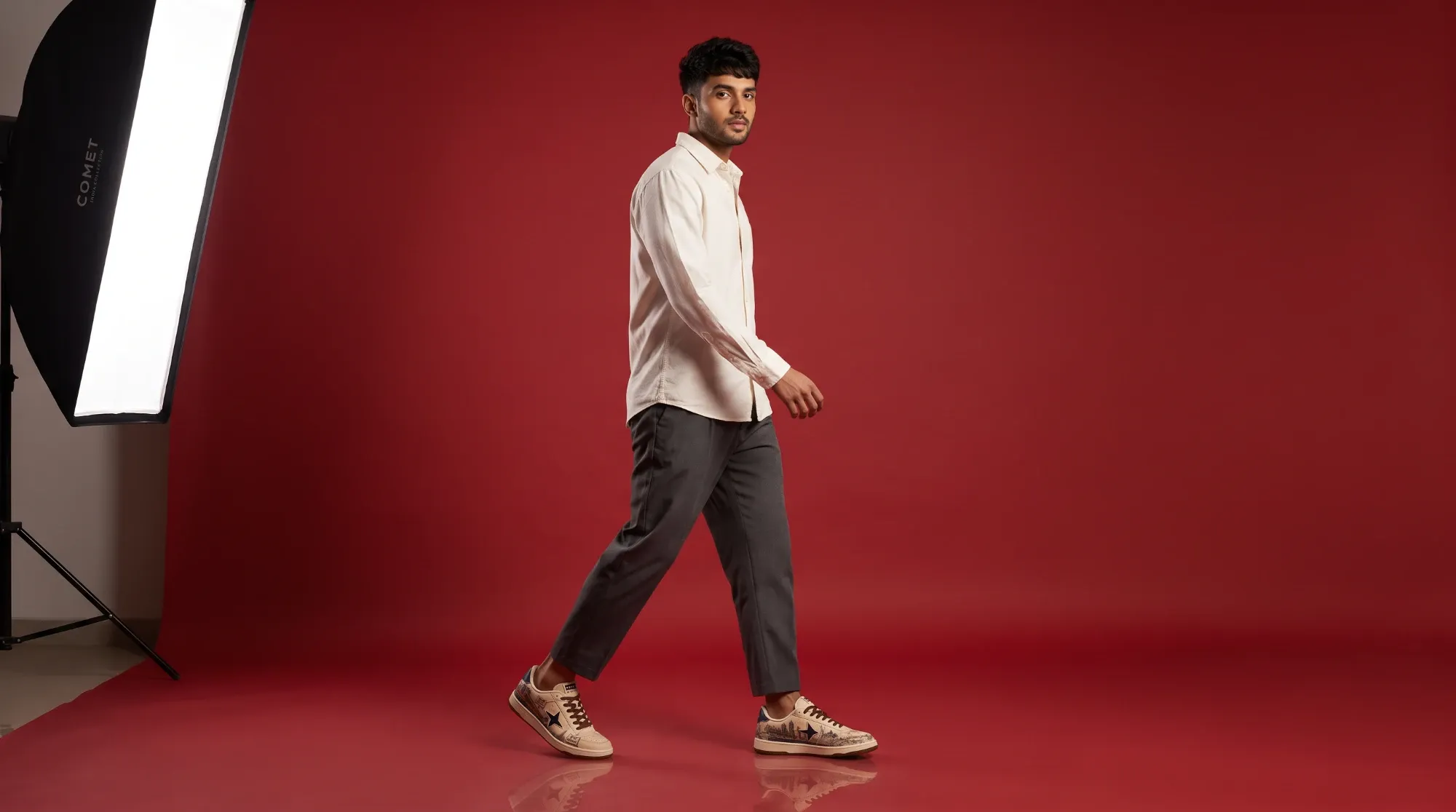
The movement of the city: local trains, the platform shed, commuters, natural light. Low angles keep the sneaker as the anchor.
02The Streets of MumbaiFrom CSMT towards the Gateway: architecture, stall culture and a vada pav between trains. Observational rather than staged.
03The Red SetThe city falls away. A vermilion set, deliberate shadows and strong silhouettes make the sneaker the hero object.
The product never changes between worlds: cream canvas, navy star, gum sole and the same Mumbai artwork in every frame. Only the world around it does.
Platform Local
The movement of the city: local trains, the platform shed, commuters, natural light. Low angles keep the sneaker as the anchor.
The Streets of Mumbai
From CSMT towards the Gateway: architecture, stall culture and a vada pav between trains. Observational rather than staged.
Sagar · Sapne · Sheher
Same city.
Different stories.
The line printed on the lid travels with the shoe into the street.
The Red Set
The city falls away. A vermilion set, deliberate shadows and strong silhouettes make the sneaker the hero object.
MUMBAI IN MOTION
A city that never stops.
Out in the city
Proposed placements: a station hoarding for the commute, a feed post for the reveal, a story for the street. One line per world, the same lockup on each.
Proposed rollout
- Tease · the platform hoarding and the launch film, no product name.
- Reveal · feed posts and the red-set frames: the shoe as hero object.
- Drop · stories from the street, the poster box, the site as the destination.
Select any frame to view it full screen · 14 frames
09 · Studio
The thinking
behind the work.
One idea runs through every part of COMET 2.0: Mumbai in motion. This is the process behind it: the references, the directions tried and dropped, the structure of the box and the decisions in between.
- 01 Art direction
- 02 Iterations
- 03 Product design
- 04 Packaging structure
- 05 Campaign direction
- 06 Design decisions
01
Art direction
Five sources, one visual language. Each one leaves a mark on the shoe and on the campaign.
The local train
Red-and-yellow rakes and open doors set the campaign's first world, and the low, platform-level camera.
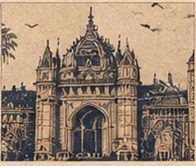
The terminus
CSMT's arches and dome give the street chapter its architecture, and the shoe its one-weight etching line.
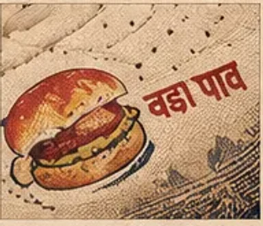
Street culture
The vada pav stall: the everyday ritual a souvenir would leave out, staged as a pause between trains.
Vintage postcards
Hand-tinted views, borders and postmarks: framing, limited ink sets and the box's poster composition.
Hindi–English type
Enamel station boards, Devanagari stacked over Latin capitals: the voice of the shoe, the box and this site.
02
Iterations
What changed on the way, and why. Each of these was a real fork in the project.
Three directions, one silhouette
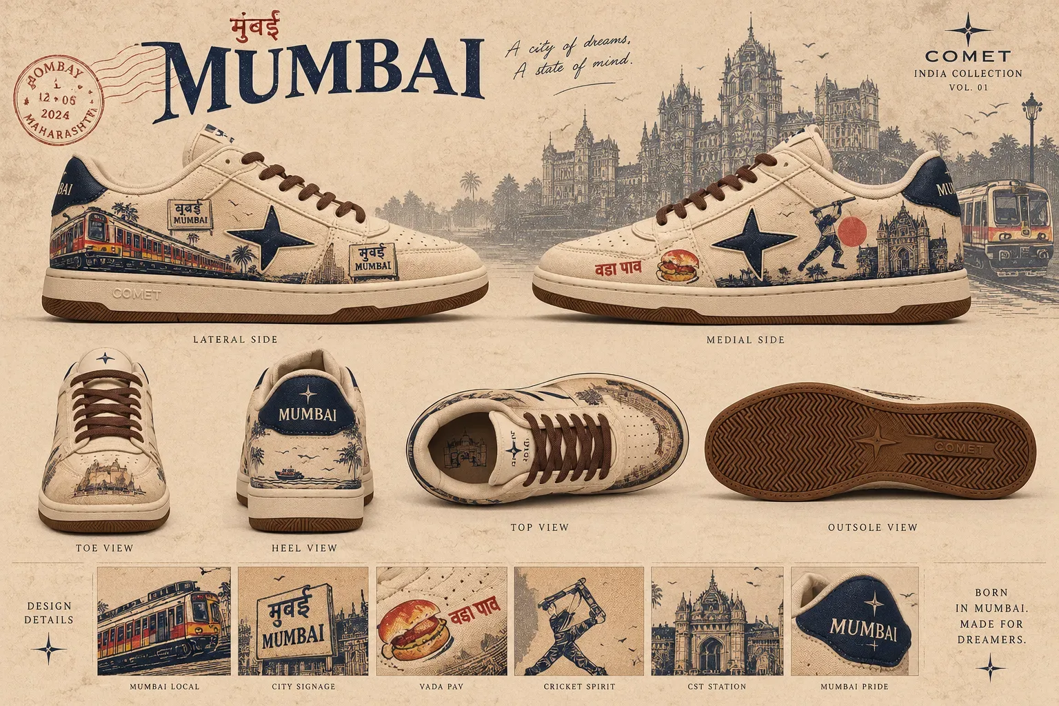
Platform LocalChosen as the hero
The most wearable: one scene per quarter, a clean vamp, everyday colours. It carries the commute, the core of the idea.
PostcardCollector's edition
The strongest packaging story, so it became the box system. Busier artwork suits a smaller, collectable run.
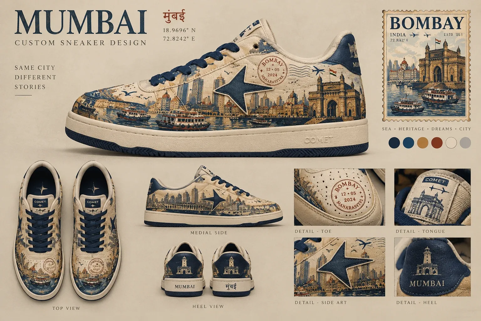
HarbourStatement edition
The only all-over print. Too loud for the hero, right for a limited third drop.
The opening, three times
v1 · real-time 3D shoe
Dropped
A parametric 3D shoe built in code read as a blocky toe, a slab sole and smeared artwork: worse than the boards. Without a properly modelled shoe, 3D was the wrong medium.
v2 · Storyboard
An illustrated platform in the shoe's own etching language, animated in CSS. It proved the camera push into the shoe, but read as a drawing, not a launch.
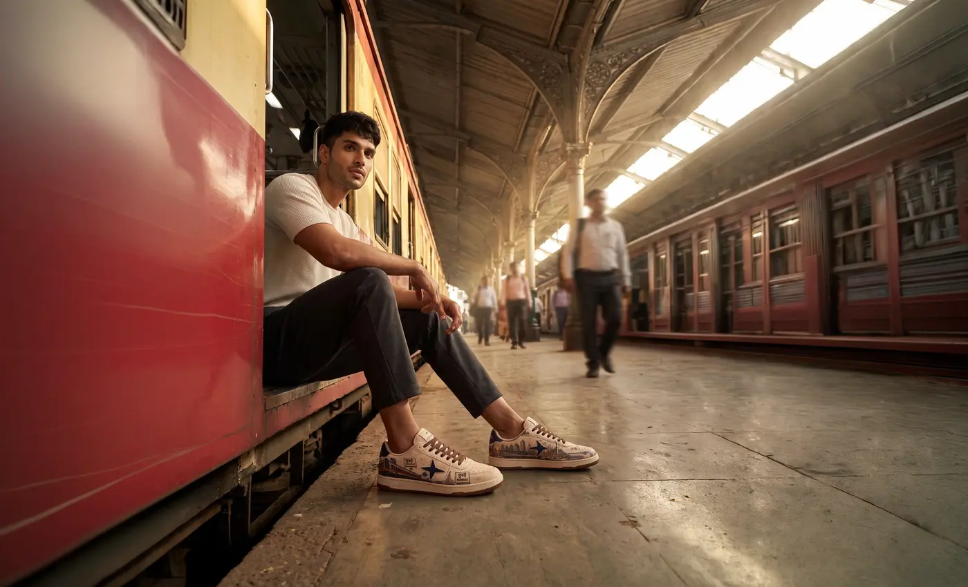
Final · the campaign frame
The same move on a lifelike platform. The frame was extended to landscape for wide screens, and the push lands on the commuter's shoe.
Making a studio frame
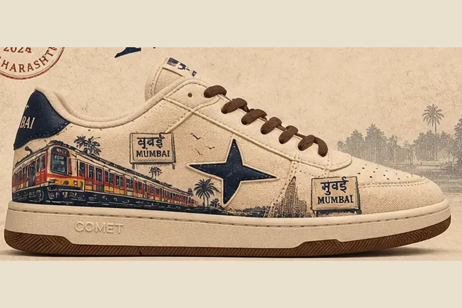
01 · Board
02 · Cut-out
03 · Staged & graded
Proofreading the city
मुबई मुंबई
The board's sign tile drops the anusvara, the dot that makes it Mumbai. Logged for the production artwork and flagged on the site rather than hidden.
बंदर हार्बर
The Harbour edition's Hindi name first read बंदर, which most readers take as “monkey”. Renamed हार्बर, the word Mumbaikars use for the Harbour line.
03
Product design
Platform Local from every side. The silhouette is a classic low-top court shoe; the city lives in where each graphic sits.
Lateral. The train, the station sign and the star — the side the city sees.
- The star
- Navy, on both quarters, laid over the artwork: the one constant across editions and the root of the comet mark.
- Local train
- Runs heel to toe along the lateral quarter so it reads as motion when the wearer walks; stops short of the star and below the eyestay.
- CST artwork
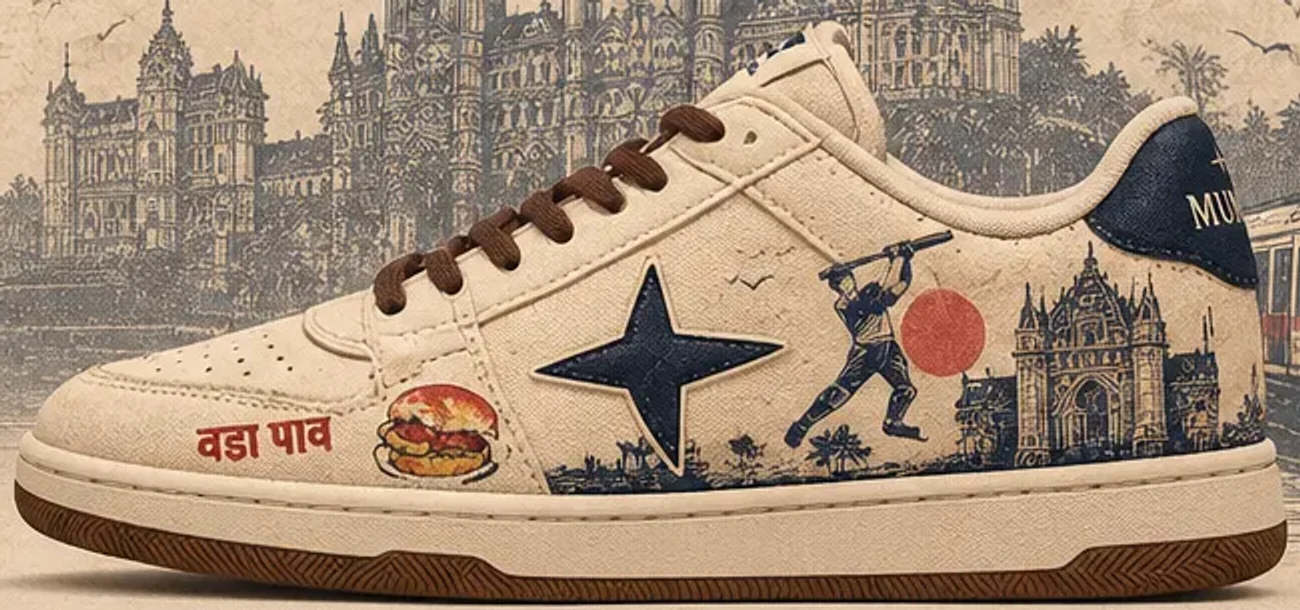
- Medial heel quarter, drawn as an etching in one weight of indigo: the silhouette reads from a metre away, the hatching up close.
- Vada pav
- The only full-colour illustration, placed low near the toe to be discovered rather than announced.
- Typography
- Boxed मुंबई / MUMBAI station tiles on the quarter, MUMBAI embroidered at the heel, COMET woven on the tongue.
- Materials
- Cream canvas upper, navy suede star and heel counter, chai-brown laces, gum herringbone outsole with a star medallion.
04
Packaging structure
A two-piece box with the lid as a poster. Proposed dimensions; the unboxing is paced in three beats.
- Beat 1
The lid
A poster: the shoe breaks the frame, CST etched behind, a red sun. It reads from across a room.
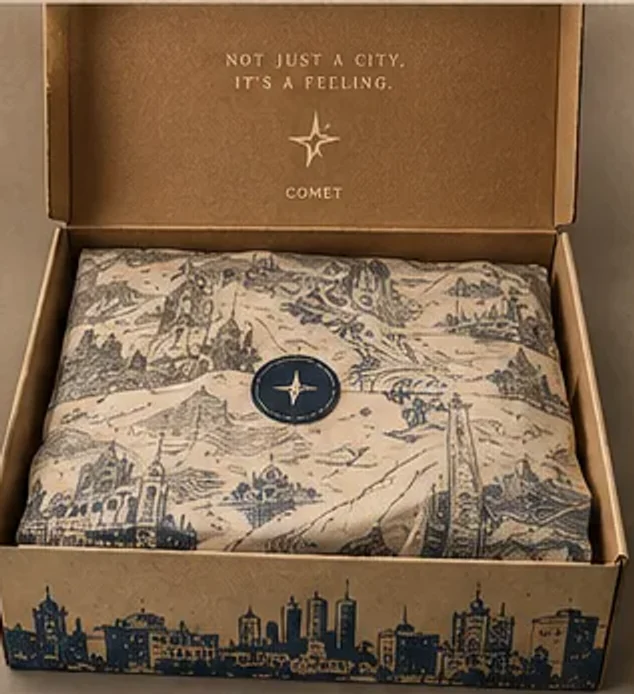 Beat 2
The wrap
Indigo toile tissue redrawn with Mumbai scenes, closed with a star seal: a pause before the product.
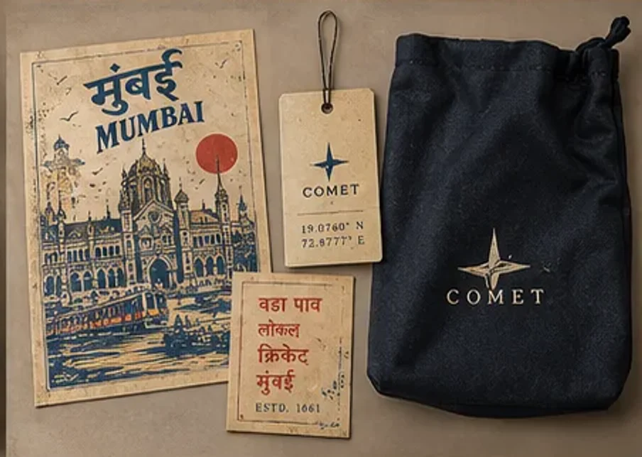 Beat 3
The keepsakes
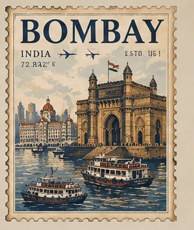
A postcard to send home, a ticket-style hang tag and a navy dust bag: ephemera that outlive the box.
05
Campaign direction
Three worlds, one product. The camera language moves from observed to controlled as the campaign travels from the platform to the set.

06
Design decisions
Why it looks the way it does, and how the physical product and the digital experience share one system.
- Platform cream#ece2cf
- Signal navy#1d2a4c
- Charcoal#1f1d1b
- Terracotta#b3533a
- Gum#7a4a29
- Set vermilion#9e2521
- Colour
- Cream is the canvas, so the illustrations read like ink on paper. Navy carries the brand (star, heel, lettering); red appears only in the train and the Devanagari. The vermilion set is the cream sneaker's strongest contrast.
- Graphic placement
- Scenes live on the quarters; the vamp and eyestay stay clean. The loudest references sit where the eye lands first, the small ones low, near the toe.
- Typography
- Two scripts, one hierarchy: Devanagari is the voice, hand-painted and red; Latin capitals are the label, in navy. Every Hindi word is proofread.
- Materials
- Canvas because it takes print like poster paper; suede for depth in the navy; a gum sole for warmth underfoot.
- Packaging
- The box extends the shoe rather than protecting it: a poster outside, the city's ephemera inside, and the campaign line on the lid.
- Storytelling
- The site moves like the campaign: platform, street, detail, box, set. The product stays fixed while the world changes, and motion stays restrained so the work leads.
10 · Product specifications
Studio frames place the approved board renders on a photographic set; the other views are the board renders themselves. Nothing here is a photograph of a manufactured shoe, and there is no 3D model on this page.
Mumbai in Motion — Platform Local
लोकल
Built around the morning slow local: a red-and-yellow rake along the lateral quarter with a station sign above it, and on the inside the things you meet on the platform — vada pav, a gully cricketer, the terminus itself.
Materials & construction · proposed
- Upper
- Cotton canvas, artwork printed edge to edge
- Overlays
- Suede star and heel counter, embroidered MUMBAI
- Collar & lining
- Padded collar, cotton twill lining
- Laces
- Flat cotton, edition-coloured
- Sole
- Rubber cupsole, herringbone outsole, star medallion
- Insole
- Printed footbed
Design details & inspiration
- The Mumbai LocalLateral quarter, behind the star
- Chhatrapati Shivaji Maharaj TerminusMedial heel quarter
- Station SignageLateral quarter, above the train
- Vada PavNear the toe
- Gully CricketMedial quarter
- Heel TabHeel counter
- The Comet StarBoth quarters
- OutsoleUnderfoot
- Brand
- COMET 2.0
- Collection
- Mumbai in Motion
- Edition
- Platform Local
- Silhouette
- Low-top, cupsole
- Eyelets
- 6, metal
- Status
- Concept — unmanufactured
 Ships in the poster boxToile tissue, postcard, hang tag and dust bag